Research Diary
Week 1
This week I have been given the task of Researching how to...Research! To help me on my merry way I have been given a card with the letter G and a picture of a girl on it. I must base my research on these topics, preferabley girl but ultimately, something beginning with the letter G. So here we go with a bit of brainstorming with general things that are related to the word Girl(or perhaps the letter G if nothing decent turns up).
Brainstorm
I remember a while back reading an article in the National Geographic magazine about the infamous "Afghan Girl" who's picture became an iconic image. Off I go to find said magazine...
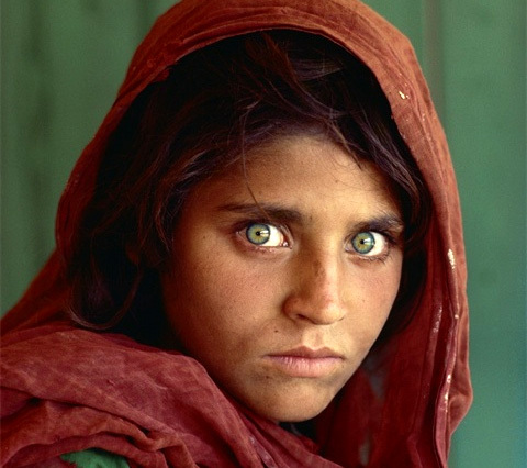
Magazine achieved! And here's the picture of said girl. Check those eyes out! They could pierce a hole in your soul. Will definitely do a bit more online research, but this works perfectly as an offline source and allows me to vary my referencing to get a better idea of how it all works. Let's see what else there is...

Aha! Girl Skateboarding Company. Somehow forgot all about them. The official team of skater's such as Eric Koston and Mike Carroll. That'll swing things in a different direction.
I'm happy enough with that I think. The National Geographic article gives me an online source and I can also credit the photographer with the photo which will give me more experience with referencing. The Girl Skateboard Co. will provide numerous online sources and I can look into a few of their skater's and see what they have done in recent history.
Along with this I also tried to look into the origins of the Men's and Women's Bathroom logo's. This was for both my research of the word girl and my representation of the word girl using Adobe Illustrator. This proved harder than expected and I still have literally no idea where the concept came from. I find this surprising considering it is used everywhere in the world(bar Warsaw according to Wikipedia which uses a Triangle for Women and a Circle for Men). Although it is not used as part of a brand or company for example, it is immediately identifiable by probably everyone over the age of 5.
I considered doing a few more obscure efforts such as Motley Crue - Girls Girls Girls and Gossip Girls but I don't want to delve in that deep or in such a girly direction for now.
Week 2
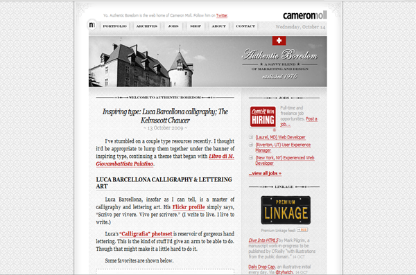
I have been set the task of researching a Web Designer this week. I've been given a list of 12 to choose from based on their portfolio sites and some of the projects they've been included in. I've narrowed it down to Cameron Moll and Shaun Inman. Let's take a look at the two sites.
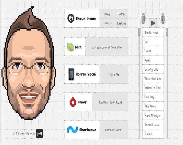
Both have pretty sweet websites but it's gotta be Shaun Inman for his originality. The use of pixel art is outstanding to be fair. So sorry Cameron but Shaun it is...let's research.
Alrite so, just checked my .Net magazine that arrived in the post a week ago(Yes it took me a week to get round to it) and lo' and behold, it features an interview with none other than Shaun Inman! What an outstanding stroke of luck. Especially as it's proving to be preeeetty difficult to find some Background details on Shaun. Tried Facebook stalking him and everything but all I found was a gnarly surfer guy with the same name:
So what do we know about Shaun Inman? His website tells us that he's a successful designer/developer coming straight outta Chattanooga, Tenessee and originating from Norwood, Massachusetts. He studied Graphic design at Savannah College of Art and Design and then spent a few years in Baltimore, Maryland before finally his interest shifted to a bit of web design. In terms of his Age, Date of Birth, Star Sign etc. it's anybodies guess. He appears to be a bit of a mystery man, choosing to let his work do the talking.
Taking links from his Portfolio site I have found his 2 Major projects:- Mint and Fever. It's becoming apparent that he has shifted much of his attention onto the creation of Apps like Mint and Fever as opposed to Client Web Design. It's quite interesting to see how much he's reinvented himself and how successfully to boot. It's good in a way to see stalwarts of the industry branching out and taking on different elements of the web design world.
For now I'll get the write up started and see if I can find some more information during the way.
Week 3
This week I've basically just been setting up the styled version of my research. I did however take the time to look into Shaun's other recent projects: Horror Vacui and Shortwave which are a iPhone/Pod Game and bookmark app respectively. It interested me to see that he had delved into markets such as Games for the iPhone. He really is a Jack of all trades type of character. The only difference is he's pretty damn good at all of the trades he dabbles in.
I've also been looking into a few Web Designers at my own discretion. In the past I have found Chris Coyier to be very helpful with his online tutorials featured on his website CSS Tricks. Interestingly enough, he has only been in the Web Design field for little over 2 years and yet has had a wealth of success.
Week 4
Crit Session
This week we had our first critique session to go over what was good and what was bad about various peoples pieces of work. To my absolute delight, mine was the first to be assessed(sarcasm), however it turned out to be very worthwhile and I took down numerous notes based on the advice sent my way.
- Put the three options(Home, Research Diary and Creative Experimentation)in a line instead of piled on top of each other
- Don't have everything centered, ESPECIALLY text. It looked particulary awful up on that big screen.
- Instead, have it featured from the left. It looks a lot cleaner.
- Too much white text. Vary it up but stick to the colour theme.
- Container possibly too wide? Text is hard to follow due to the length of sentences
- Unordered List tag used to frequently when not required. The paragraph tag is much more relevant and doesn't overrule other tags
- The logo sucks. Have another bash and feature the Username somewhere else
- Add Girl drawing(Pink Woman) to Week 1 Homework
- Remove CSS from Week 1 Homework
Week 5
Creating a Monogram
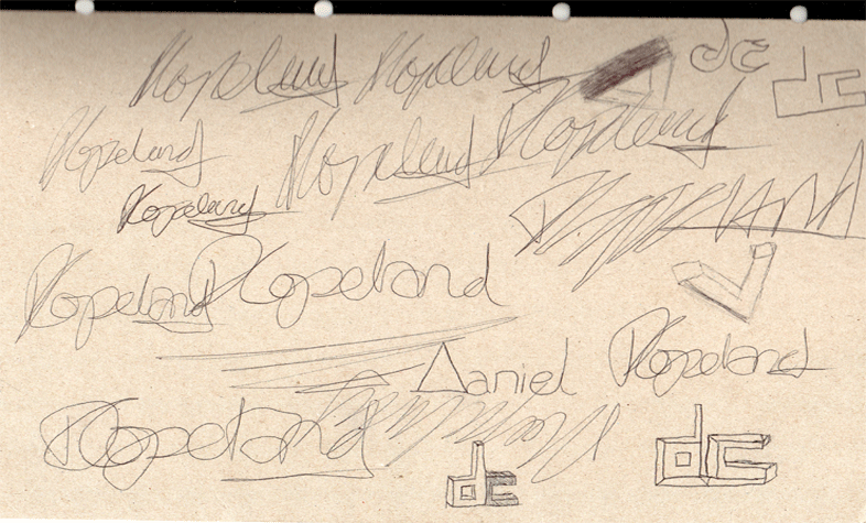
This week we have begun the topic of personal identity. This will involve trying to create a logo of some description for ourselves using a Monogram, Typography, Iconography or a combination of 2 or more of the subject. This week we have been asked to create a Monogram for ourselves. I will do a bit of research into famous logos that have came about through using this as an option and then try and come up with a few ideas myself.
I'll draw a number of famous logo's and make my own take on the ideas to see if I can come up with anything.
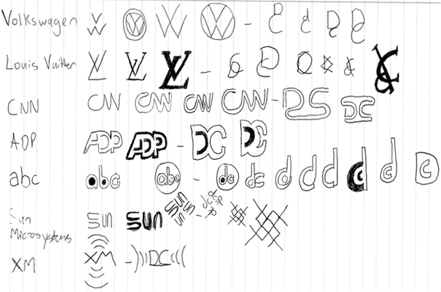
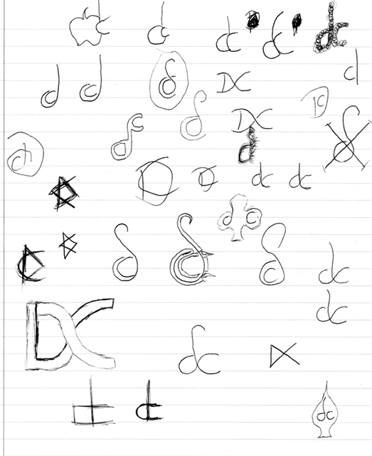
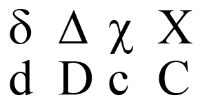
I also toyed with the idea of using letters from the Greek alphabet to create my Monogram.
Personality Test
I was recommended a personality test by Tim and Ian that was featured on the Science and Nature section of the BBC website. Here are my results:
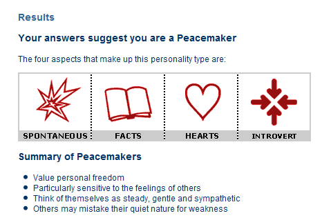
Peacemakers focus on the present and enjoy helping others in practical ways. They are sensitive to the world around them and take quiet joy from people and nature, particularly animals. Peacemakers value close relationships, but it may take time for others to get to know them.
Peacemakers are the most likely group to say they dislike reading history books, according to a UK survey.
Peacemakers live by a set of personal values, which they work hard to reflect in their everyday life. They would rather support an activity than organise it. When they do find themselves in leadership positions, they observe quietly and lead by example.
In situations where they can't use their talents or are unappreciated, Peacemakers may withdraw and become self-critical. Under extreme stress, Peacemakers may become even more critical of themselves and others and make harsh judgements about minor issues.
Peacemakers tend to show someone how much they care about them by helping them in a practical way rather than putting their feelings into words.
I was surprised at how accurate the test actually was. A lot of the points it made were ones I could relate to. It was definitely an interesting and worthwhile test
Week 6
Creating a Typograph
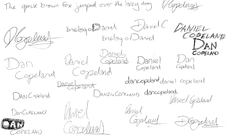
Carrying on with the theme of personal identity we moved on this week to look at the creation of a typograph. This involved creating a representation of my name for use as a logo. Already, I had the idea to carry on with the idea of my Monogram and transform it into my full name or my last name featuring the first initial of my first name. However I was willing to look into other possibilities first and foremost and try to come up with an alternate idea.
Again I went about tackling the challenge in the form of pen and paper. This is what I came up with.
I also read into a top typographic designer who was recommended to me by one of my IMD compadres. The designer is called Paulo Gabriel and has provided a lot of work on the link provided. Here are a few examples.
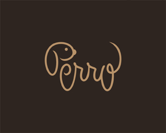
I think the design of the text to look like the animal it's representing(Perro means dog in Spanish) is absolutely outstanding. It clearly took a good bit of detail tto put together and it's definitely something that I will look into in the future to try my hand at.
Week 7
Creating an Icon
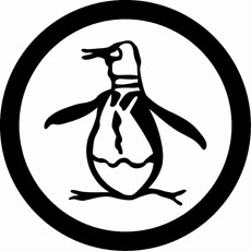
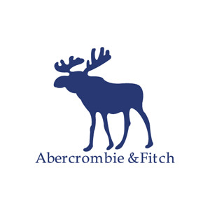
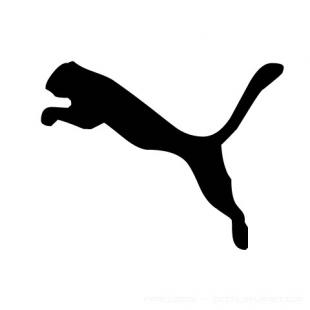
This week I am setting out to design an Icon for myself. Straight of the bat I am thinking of some sort of animal to represent me but I don't which one would apply. I'm a big fan of logo's such as the Original Penguin Clothing Company, Abercrombie and Fitch and Puma which can all be placed against any sort of background and be destinguishable.
2 out of 3 of these companies actually have the animal in question in their name and so I feel it would be a bit over the top to have one for myself. Especially as my name has no destinctive connections to any animal names.
I then thought of the idea of taking my name and putting to different use. As we know, many countries have names ending in land eg. Poland, Finland, Ireland and so on. I decided to try and make someway of displaying my icon in the shape of a country, and a made up one at that. The idea gives a broad range of imagination so I'll get cracking with it.
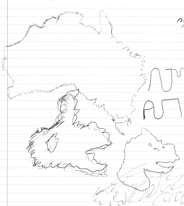
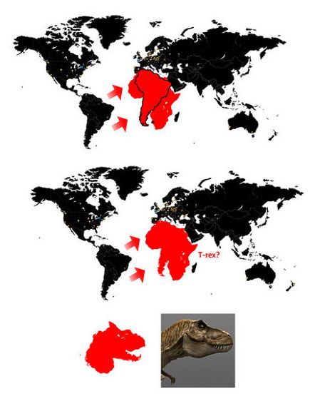
I had a crack at drawing the outline of Australia to begin with, then tried to fashion a shape using my initials. I then stumbled upon an image on the net that showed howplacing South America on top of Africa on the map makes the face of a T-Rex. So I had a go at drawing these as well.
Having done something similar in a project that I ended up not using last year, I decided to go back and see if I could salvage anything from the PSD file I had saved. After toying around with it a bit it started to take shape and look pretty decent. I have placed what I finally came up with in the main section of my online work.
Week 8
Crit Session
We had our second crit session this week. I took a chance and rolled in a bit late in the hope that I wouldn't be brought up first again. Nah, in all honesty my time keeping is just awful. After looking over a few other peoples websites I decided to go ahead and have mine assessed feeling fairly confident with some of the work I had produced over the three weeks.
The results were fairly pleasing. The design of my monogram was well received. I had to some degree worried about the simplicity of the straight lined features, but it appeared to work well in my favour.
The typogram received mixed reviews, with Ian stating what I had thought myself about how over the top it was in terms of the amount of lines used to create the final design. Instead of totally changing it, I intend to alter it and simplify the design down a bit. It was suggested that I take the "D" from the beginning and just use "Copeland" as both my typogram and potentially my branding on the website.
Finally we covered the Icon which I was feeling fairly unconfident about if I'm honest. Thinking back, I began to feel like it was a bit basic looking. Especially the one I had submitted as the main example, generally I think some of the designs which featured full colour worked better. The reaction to it caught me by surprise a bit. Although it was granted that a bit of work needed to be done to the original design, it was generally accepted as a good idea both in the sense of a brand and as a theme for the website. Ian suggested that I lower the height of the design so that it is more accessible to use throughout the site.
Once again the session proved to be very worthwhile in my eyes and I came out of it with a fair idea of what I had to do, to make what I had created even better. I will now set about making the changes and possibly implementing the ideas into my site design.
Week 9
This week begins the third part of our module and the creation of a Portfolio for ourselves. We must begin it off by setting up a Content audit, sitemap & a navigational structure. Therefore this week I am going to do a bit of research on the three and see what exactly will suit me best.
I will go straight to the source and see how the masters use it, going back a couple of weeks and looking at the Web Designers we were asked to research and see how they've set their sites up.
First up is Shaun Inman's. As I have thought to myself before, his is a site that is quite unique involving not too many pages whatsoever. His homepage provides links to 4 of his recent projects(this takes up the most space), 3 links to his social media outlets and the one link that is internal within the site - his blog. Once in the blog however we see the different pieces of site where we might garner a bit of information About, Archive and Contact pages.
So that was an interesting start and an approach I assume most wouldn't advise. Having only one internal link featured on the home page which then goes on to link the rest(which there aren't many). Having said that though I like the idea behind it although I know others would think differently.

Here we have Cameron Moll's which is a bit more by the book, featuring all the main links in the site on the homepage. He includes his Portfolio, Archives, Jobs, Shop, About and Contact. A few of the options are strange to such as Jobs and Shop, which it turns out are one of his projects and a place to buy his works respectively. It doesn't seem like the place to put them along with the internal elements of his site, but each to there own.
I think putting a healthy number of links on the homepage is the way forward, due to the apparent amount of time the typical person spends browsing a site. If they don't see what they won't right away, they will flee. This is probably all well and good for a bigger designer such as the two I have just talked about but for a designer who is only up and coming it doesn't fair well and probably won't work out. Any elements that aren't of such high importance can be put further into the site but all in all I don't want it to go too deep at all. I will now go about drawing up a few ideas for my content audit, sitemap and navigational structure and get on my merry way to designing a site for myself.
Week 10
Moving on from last week and carrying on with the theme of creating a portfolio site for myself, I will now look at Page layouts, wireframes & visual comps. All three of these are of vital importance in setting up a website. Sitting down and drawing up the ideas whether they be on a computer or off it will benefit you not only in the beginning but also during the design process and will ensure you don't have to go back to the start and begin again due to flaws that could have easily been avoided.
Page layouts are good to draw up to get a general idea of what type of site you are going to go ahead and create. Starting off with pen and paper is vital in my opinion. Diving straight in on the computer can prove wreckless and leads to numerous problems as I have discovered in the past.
Wireframes work well in piecing a site together and lining up the specific bits and pieces that make the page what it is. The site must look good along with working well or the user will have little or no interest in using it for a prolonged period of time. It makes the design process on web easier if you know that certain elements are going to come together, plus you know what size to make images, containers, headers and footers and so on.
Creating visual compositions is the most important part in the pre production of a website. If it doesn't look or feel right in the Photoshop mockup then it probably won't come together on the web either. All tinkerings must be done beforehand to know that everything will fall into place. Furthermore collaboration with the wireframes is essential in order to keep in tune with the size guides.
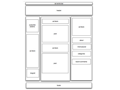
Here we have a stereotypical wireframe and the type of thing I'm going to try and put together.
Week 11
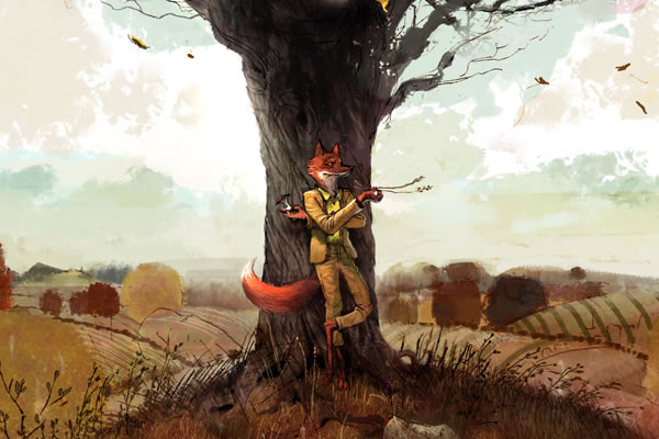
This week I'm well into designing my website. I have taken on a Forest based colour scheme and I am including a tree in my design.
The concept of the tree came after watching the recent remake of Fantastic Mr Fox. In the movie the protagonist(Fantastic Mr Fox) moves into a huge tree in the forest. I thought the design was tremendous and I liked the idea of including it in a site. I also enjoyed the added humour of chopping the tree down to make way for content in the internal pages. It works as a contrast against the theme of nature on the homepage moving onto a theme of disturbed nature. Take from it what you will!
I had originally wished to include roots coming from the tree down into the footer and leading to the links. After having a number of attempts to make this happen, I became disheartened with the idea and eventually gave up after deciding it just wasn't going to work. I may look into it again in future, but for the meantime I feel the page looks better without the roots in place. I'm not trying to make it too realistic after all, simply just to give it a feel of something out of the ordinary.
Week 12
This week I am working away at my site and testing it to ensure all links etc. are working correctly. As an added bit of research I have looked into finding some decent social networking icons. I wish to find one's that have a kind of nature theme going on to tie in with the nature theme that's obvious throughout the site.