Creative Experimentation
Week 1
This week we have been given a card to research. It is there to help us with the world of research in order to know when it is necessary to reference what you are using etc. The card in question is one from a pack that have came from the Early Learning Centre and as such is fairly childish in appearance. Having received the letter G with the picture of a girl on it, I decided to try and recreate the card in Adobe Illustrator. At the moment the card features a green lower case letter G which is particularly appealing to children due to its curves and lack of seriousness. The picture of the girl takes on a similar approach and features a number of colours which again is visually appealing for children
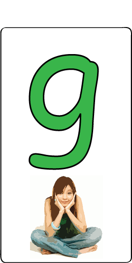
Here is my take on the card. I altered the letter to look as similar as possible to the original. This involved using a ready made font and altering it using Adobe Illustrator, taking certain parts out of the letter and adding curves to try and get it as close to the childish one represented on the original card. The picture of the girl, I acquired of the internet and altered using a series of Filters. I felt this was the best route to take considering the level of detail it would take to recreate the girl in the card. As a compromise I took on my own interpretation of the word Girl and tried to create a representable image.

Here we have what I created. I had a go at designing a variation of the "Women's Bathroom" sign on Adobe Illustrator. I've often thought that both the women's room and men's room signs are two of the most recognizable logos in the world and thought it would be interesting to have a go at modernising it to some degree. Obviously it is in no way serious and I wouldn't even dream of putting it forward as a replacement for the old one but I feel it's an interesting take on it none the less. I made the body using the Pen Tool then did the rest, including the hair using the Brush Tool using what I would call 'girly' colours to enhance the effect.
Week 2
This week I went about designing a theme for my Homepage. Although we are going to be creating a portfolio site for ourselves later on in the semester I felt it was necessary to have something different other than the boring unstyled set up that I have going now. I had decided on a sky blue background but couldn't work out what other colours should be used to complete the theme. After toying around with a number of ideas, I stuck on the theme of orange, blue and white. Black will also be used for some of the fonts. Altoghether I am happy enough with it considering it will only be in place for a number of weeks.
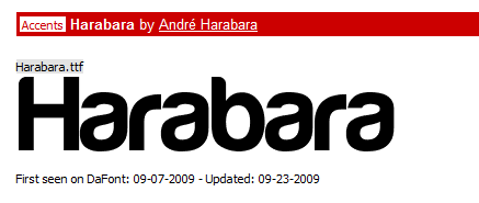
I decided to search for a different font to use on my website. I searched through a number of different font sites and eventually found Dafont. It is a surprisingly good site that provides numerous fonts that they provide for free. I found a pretty sweet one called Harabara which was Free to use and decided to go ahead with it.
I decided to use this font for the three Module titles at the top of the page. At first I went about using 3 different colours for each button, Red, Yellow and Green. Plain and simply it looked awful. I then decided to try 2 white buttons on each side including an orange button in the middle. This was a lot more aesthetically pleasing.

Week 3
This week I toyed with the idea of creating a header for my site. I came up with an idea that I have put in for the meantime which follows the same colour theme and includes my name/username.
I'm not particularly happy with it however and fully intend to move forward next week and try something different.
Ultimately I know I will create something completely different for my portfolio site which keeps playing on my mind so for the time being I may just leave it in.
Week 4
This week I toyed with the idea of creating something for the Online T-shirt community website, Threadless. I went about creating the image in Adobe Illustrator. Ultimately you can design anything you want and post it in for others to rate and if it's good enough, you receive a sum of money to have it sold on the site. As a t-shirt enhusiast(lame I know) I have considered creating something along the lines of this for a while. I like large graphic designs on the front of t-shirts. The bolder the better. With this in mind I decided to put the design up against a white t-shirt and make the graphic spread right across the fron of the garment. This is what I came up with.
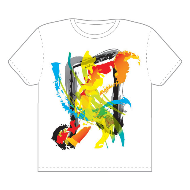
My idea is that the colours represented at the front are the person dancing to and gradually becoming one with the music. We see in the background the Music symbol which is created in a similar way but also designed in black to stand out. This is for the viewer to know just what on Earth is going on! I came up with the concept after just messing around a bit with different strokes. Having always had a keen interest in music I enjoyed creating something like this. I will now post it on the Threadless website and see what the community think of it.
Week 5
Into Week 5 and a brand new piece of work to get started on. Over the next 4 weeks we are to work on creating a brand for ourselves. This will involve designing a monogram, typogram and an icon. This week to start of with I have been set the task of designing a monogram. This will consist generally of me putting my two initials together, although this is not necessarily the way it may turn out for some. I think it would be best to go ahead and use my 2 initials. For the first time in my life I find it unfortunate that I have no middle name as I have less to work with. Also I feel my initials make it somewhat harder to put something together considering, in Uppercase they both meet at a rounded side. As a result I may go ahead and use the lower case equivalent of both D and C. I will start doodling out some ideas and see if I can come up with anything with some substance.
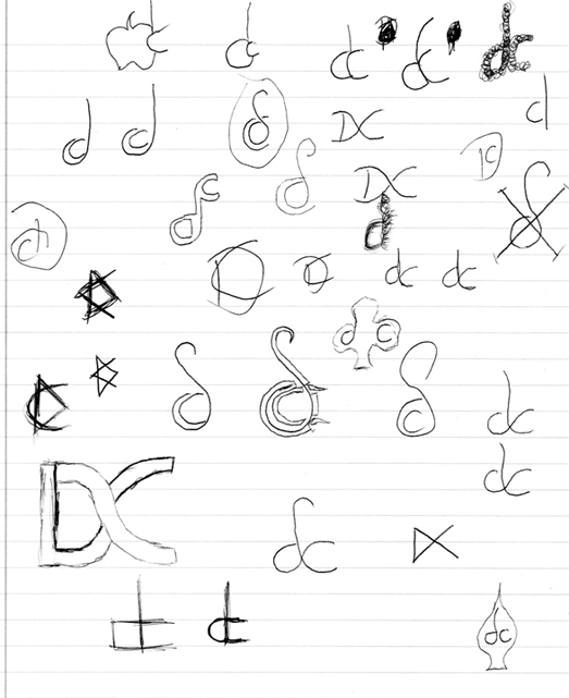
Here we have the ideas that I came up with whilst doodling with a pen and notepad. At present, none particularly jump out at me. I like the one of the lower case C within the lower case D which has the curviture at the top but I'm not sure if it would transfer onto the computer as well when designing it in Adobe Illustrator.
At present there are two companies that go by the name of DC which makes things even harder. To some degree I have to steer clear of anything remotely even like them which, despite not sounding hard, could prove to be a bit of a nuisance. I talk of course about DC Comics and DC Shoes who are both pretty well known.
Unhappy with what I have produced, I have went about researching some famous Monograms that are used by companies and are known the world over. By recreating some of them and putting my own spin on the idea I can potentially come up with something that I can design and be proud of.
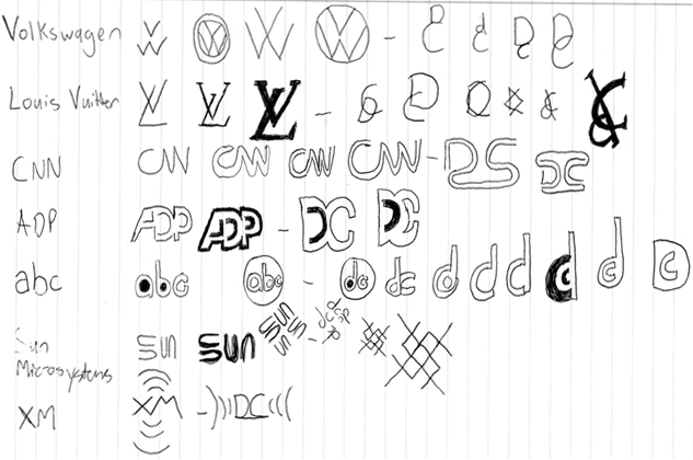
I think this exercise has proved pretty productive. I think a few of the designs here have turned out pretty well and in particular I like the concept of the one based on the CNN monogram. I think I could do a better job of it but most importantly I think I could do so on the computer with the aid of Adobe Illustrator.
At present the design is rounded which is proving fairly tough to recreate in Illustrator on top of making it look good. As a result I have decided to try and go for a straight lined effect, using as little lines as possible and yet keeping it open planned.
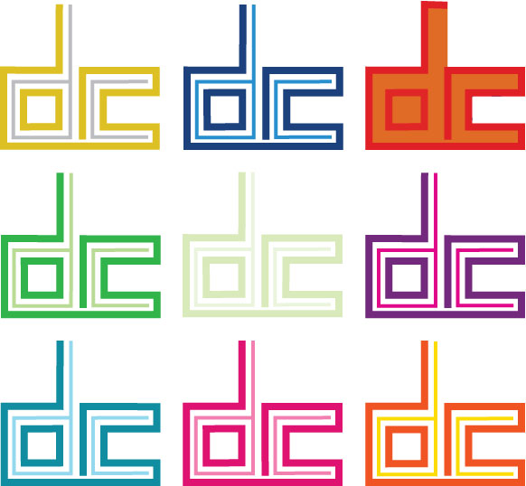
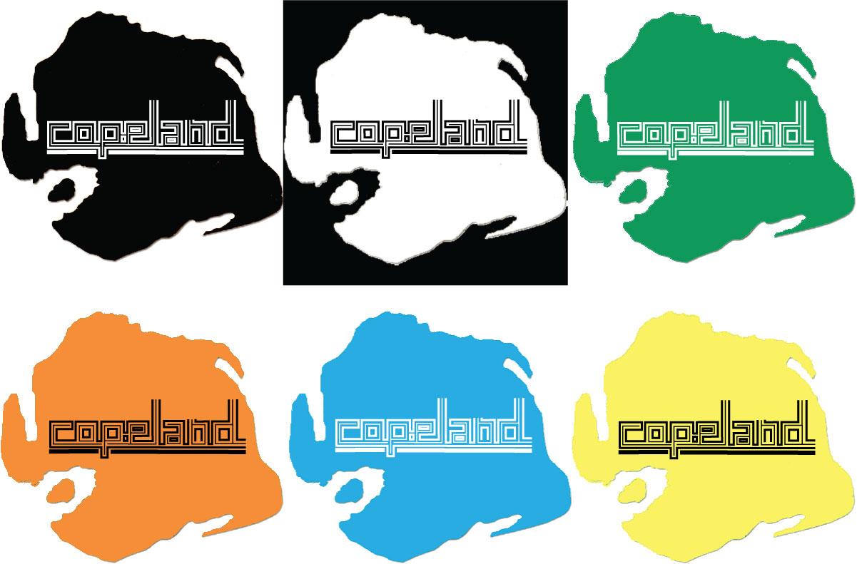
Having went through a number of stages using trial and error I have came up with the above design which you see represented in numerous colours. I have it featured in the main homework section in the colour I think it looks best in - black.
However I like the way I'm able to add the different colours to it, confident in the fact that it still looks good and represents me well. I feel like I could apply any number of colour schemes to a site and be able to fit the logo in along with it and thus I am more than happy with the outcome.
Week 6
Into Week 6 and onto the Typogram. I am feeling optimistic about the typogram after what I see as a success on the Monogram front. Right off the bat I am thinking of recreating something similar to that which I did for the monogram. It seems like a lazy option but it's no mean feat. Putting together the lines and making them look as though they were going somewhere meaningful was a hard enough task with two letter never mind something further up the scale near the number ten! But I will give it a go.
To begin with I think I will create the word DCopeland, again all in lower case font. I feel like I should keep some feature of my first name in the design but at the same time I know "Daniel Copeland" in it's entirety is far too much. It would look completely over the top and fitting it in anywhere on a webpage would prove to be quite the task. So I will have a go again at making this work again using Adobe Illustrator and sticking to the same disciplines that saw me create the last design.
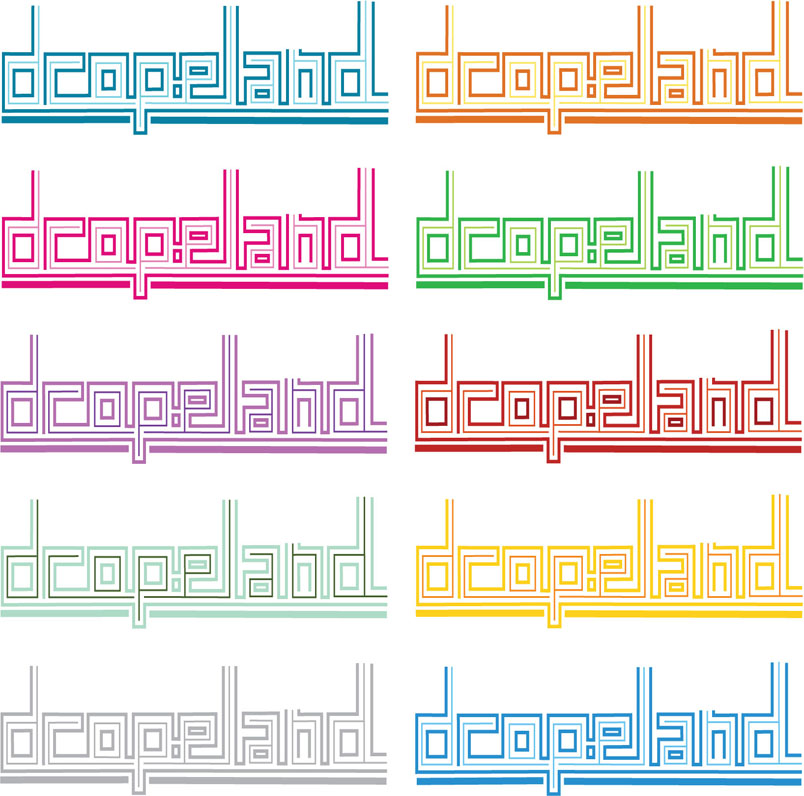
Here we have the end results again displayed in various colours. I am delighted again with how it has turned out. This took a heck of a lot of trial and error to get it just right. The likes of the letter L and P were hard to get just right as they extended out of the confines in which the rest were stuck to. This proved hard to get right but I think it makes a pretty decent effect. My only concern is that it is too similar to the monogram and I would have to feature one or the other as opposed to using them both.
I think having them both would be a great branding idea but something needs to change. I will toy with the idea of taking the D from the beginning of the created Typogram. Maybe if the DC is unique in having the D at the start, it may benefit and the same for the Typogram starting with the letter C.
Here we have an example of the Typogram without the letter D at the beginning. I think it looks well but still I worry about losing the representation of my first name. If it comes to using both the Monogram and the Typogram in the same website project I think I will go ahead and drop the D but for the time being I will leave it in.
Typograph Treatment AI File
Week 7
Week 7 and the chance to design a possible icon for myself. If I'm honest, this is the one I have been worrying about the most. My first thinking was for some sort of animal to represent me but I don't which one would apply. I'm a big fan of logo's such as the Original Penguin Clothing Company, Abercrombie and Fitch and Puma which can all be placed against any sort of background and be destinguishable. 2 out of 3 of these companies actually have the animal in question in their name and so I feel it would be a bit over the top to have one for myself. Especially as my name has no destinctive connections to any animal names.
I then thought of the idea of taking my name and putting to different use. As we know, many countries have names ending in land eg. Poland, Finland, Ireland and so on. I decided to try and make someway of displaying my icon in the shape of a country, and a made up one at that. The idea gives a broad range of imagination and is something I have covered before in a project. This is a branding concept I designed for myself in a tech project
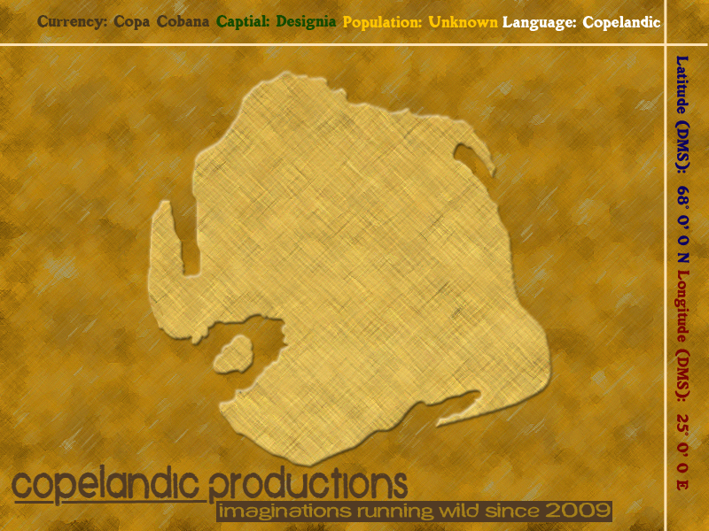
Having designed the shape of the country myself I feel I could use it again, potentially altering it size wise and maybe applying my monogram or typogram to it to finish of the effect. I will have a go at this now and see how it goes
Again here we have the finished article in a number of different colours to try and focus in on a potential winner. I don't personally think the icon is as strong as either the Monogram or the Typogram but I think theres something to it and again there's a certain element of a branding idea to it.
Iconograph Treatment AI FileWeek 8
This week I have decided to ahead and have a look for a good colour scheme to use for my upcoming website that I will begin to build next week. I have been toying around with the concept of a forest/nature theme, so right away the browns, greens etc come into mind. I will have a look on Kuler and see what I can come up with.


Here we have two examples of Forest themed colour palette. I'm more in favour of the first one but I think they both need tweaked slightly. Having researched them I feel more confident about going in and making a design however and the exercise has been more than worthwhile.
Week 9
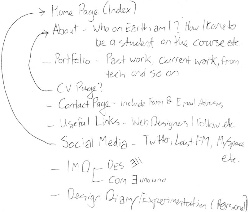
This week we begin the task of putting together our website. Firstly I need to set up my Content Audit, Site Map and Navigational Structure. This will consist of writing out a list to include in the website, deciding what elements of the site should go where and how the user will navigate from place to place. I'll get started on the Content Audit so that I know what I'm working with and which approach is the best to take.
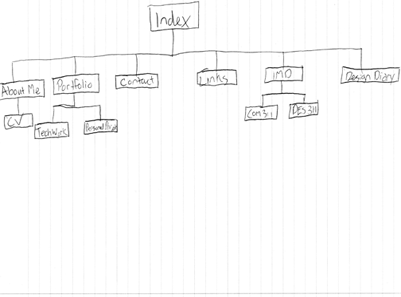
With this in place I can now go on to set up a site map. This will be what I refer to as I put the links in place throughout my site in an attempt to make it as user friendly as possible.
Week 10
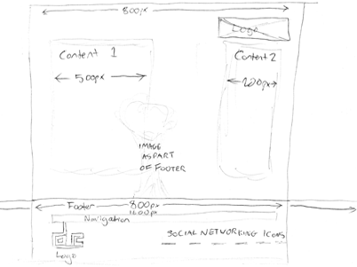
I must now push on with the production of my site and set up the Page layouts, wireframes and visual comps. This will involve drawing out my planned site with pen and paper, create a wireframe visualisation through Photoshop and design a complete Photoshop Mockup.
Here we have my Page Layout and proposed site design in the form of a hand drawn piece. It's fairly basic but it allows me to carry on and do the other two fairly easier.
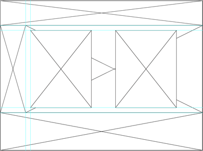
This is a basic wireframe design of how the site might look before the pieces are placed together. I will now go on to add dimensions and more visible parts to the page.
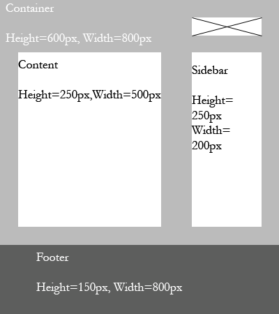
Here we have a wireframe with a bit more detail to display. It's starting to come together now with the dimensions in place and I'm starting to get a feel for how the site might turn out.
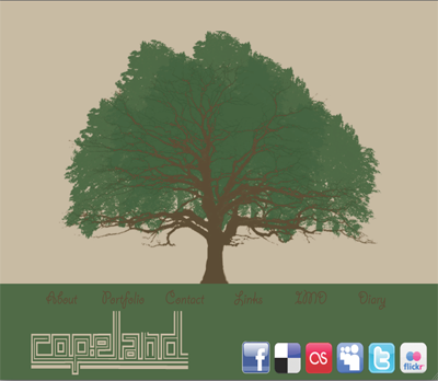
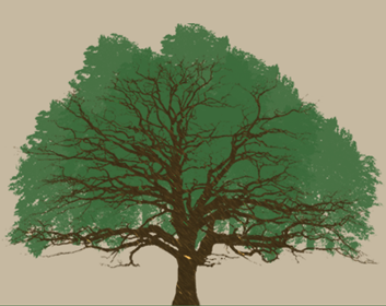
Here we have the composition I drew up for my Homepage. It features my typogram and a tree I have put together for now but may edit.
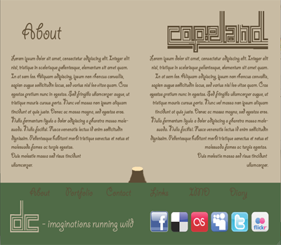
This is the internal draw up for the site. It features the tree having been cut down to allow content to appear easier.
Week 11
Week 11 brought the opportunity to carry on with my designs for my website. As I had stated earlier, I wanted to include a tree in my website. I have already included a potential one in the Composition from Week 10 but I'm going to see if I can improve it at all.
Currently the tree has been made as part of a brush set I acquired which was free to use. It has however been altered to an extent were it looks not much like that of the original. I tried originally to come up with an idea from scratch on Illustrator but I simply couldn't get it as good as I wanted it
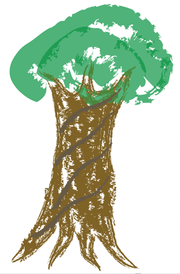
I wanted to keep the idea basic but this was far too basic and I needed to move on.
Again I went back to my previous design and altered it to give it a more woodsy feel. I also made it smaller as I found that it took up far too much space on some browsers which was a massive inconvenience.
Week 12
Into the final week and I am working away at my site and testing it to ensure all links etc. are working correctly. As an added bit of research I have looked into finding some decent social networking icons. I wish to find one's that have a kind of nature theme going on to tie in with the nature theme that's obvious throughout the site.
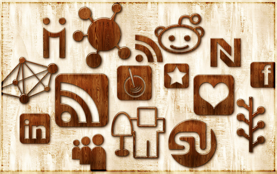
The icons didn't quite fit in with the rest of the site, so I applied a darker colour over the top of them in Photoshop and applied a Darken effect so that the two come together. Now the icons and the tree are fairly the same colour and the colour scheme is working well throughout the site.


