DES 311 3.2
3.2 - Page layouts, wireframes & visual comps
Onto the next part of my design process in creating a portfolio site. This section will require me to sit down and draw out the way I want my site to look both on and off the computer. I must handdraw the idea of the site to get a fair idea of where I'm trying to go instead of just going and getting stuck into it.
The wireframes are important in order to draw up a good design of a site. If elements of each page are just thrown in anywhere, the site will end up looking a mess. Things must be lined up and all pieces must work together to create something that not only works well, but is also pleasant to look at.
Page Layouts
This is the design I am going to go for. I intend to use a different footer for the home page and the internal pages, and I feel this design fits the bill perfectly. I will now go on to turn this into a wireframe in order to decipher what elements should go where on the page.
Wireframes
Now to set up a site map. With the content audit in place, this shouldn't prove to hard to do. I will lay out a possibility or two and see what I think of them.
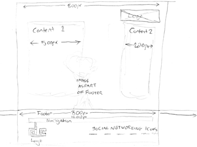
Here is a very basic idea of what the site may look like without any dimensions in place.
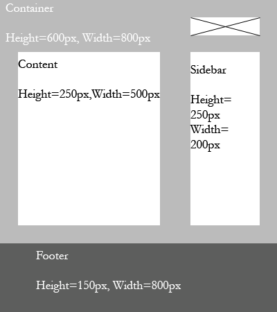
Here's a more definitive version with a few ideas in place and the dimensions such as height and width of each element set up.
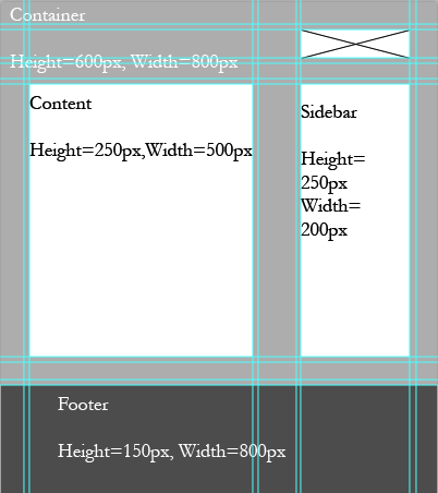
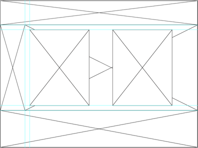
This is the same design with the guides still in place to give a better idea of the placement that will take shape.
Compositions
I will now go about designing a Photoshop mockup of what I will design on web. With my Page Layout and Wireframes in place, it should come along just nicely.
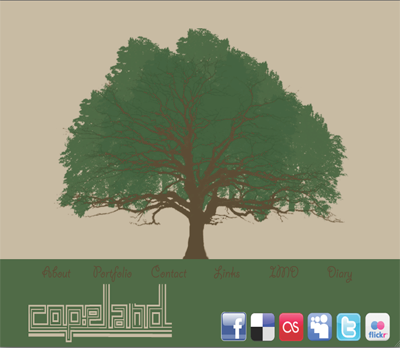
This is the composition I created for my Home Page to begin with. As you can see the Social Networking icons are all their original colours and the logo, now featured in the top right is located here in the footer. The Navigational buttons are also a different font from the one I ended up going for as I felt they were much too hard to read.
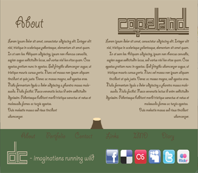
This is my internal site idea, with the tree chopped down to give the text more room to manoevure. Again there a few things are out of place or incorrect, as I decided to go on and tweek a few of the elements I had went for in the beginning.


