Research Diary
Week 1
Meeting the Client and other Shenanigans
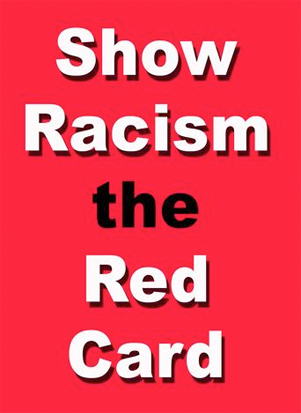
This week we welcomed the founder and administrator of Show Racism The Red Card to the class. He had come to talk to us about the project that we were set to begin. The project is based on the Show Racism The Red Card charity and we have been asked to create both a website and a new brand for the company to use from now on.
We have been set the time period of the entire semester to complete the task, and should in essence be able to come up with something pretty good to present to him at the end of it all.
Right away I am going to look at the current website and try to work out the extent of the work I will have to carry out.
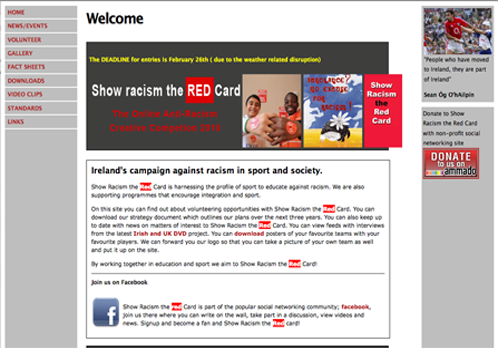
As we can see the current website leaves a lot to be desired. The set up is fairly basic and the colour scheme is none to appealing. Furthermore, there is no representable logo available which is bad in the sense of leaving an impression in the mind of the viewer.
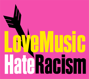
Also, in comparison to the English equivalent for example it really doesn't compare. Where the English version has really taken off and become a mainstream campaign welcoming and holding onto a decent level of traffic. Show Racism The Red Card on the other hand doesn't really have enough content to make those viewing it on first impressions, wish to come back in future.
Let's take a look at some nation's equivalents when it comes to campaigns on racism
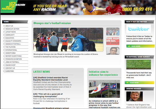
Here we see the English football equivalent. It's represented by an ongoing campaign involving player's wearing tshirts with the movement's logo featured. The logo in question is a good one in my opinion, using catchy colours and allowing for use in the colour scheme of the website among other things.
For this week, research colour schemes, various ideas that could be used. Go through the current red card site and take a look at the english/spanish equivalents. Red Card theme on Kuler.
Week 2
Working as a group and bringing ideas together
In order to work successfully as a group I feel it is necessary for us to make use of one of the many collaborative tools out there on the web. I know of a few at the moment but I must look at the accessibility of each option and see if it will suit an entire group and not just myself
Obviously we have the basic chat set ups such as Windows Live Messenger, Yahoo Messenger, IM, iChat and so forth but I feel they lead a lot to be desired and can lead to much procrasination due to their aim which is one of leisure and not of a working nature.
Google Wave
The first real possibility I will look at is the much hyped and much sought after Google Wave.
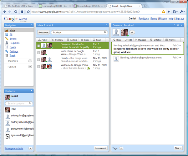
The arrival of Google Wave on the online scene created a lot of hype, with Google calling it, "the way email would look if it was created today." However after its early flurry of fanfare and everyone doing everything in their power to get one of the illustrious invites that were going about, the hype has been replaced by a wave of confusion by those who have decided to stick by it and try and use it.
In my opinion it is quite hard to get people on board with creating an account with it once they have received an invite, not to mention use the technology. It's main features are it's use of real-time technology, the ability to have group conversations which remain saved for the next time the user logs in and the ability to change what has been created by any member of the conversation. Despite it's plus points I don't think we will be using it as a group for the project.
Dropbox
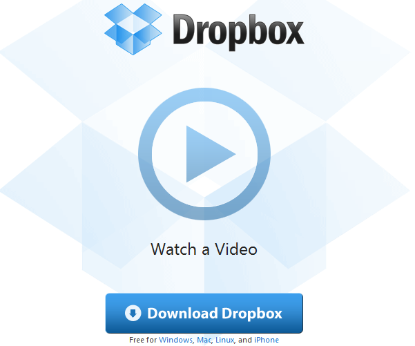
Onto a technology that I hadn't actually heard of before, until fellow IMD enthusiast David Turner pointed me in the right direction. With it's ability to upload work to the internet without going through an FTP, and linked file technology which allows numerous people to add, edit and delete content from the one file in place, it really is a useful tool to have in place for a project such as this
The fact that I personally have access to the files on my iPhone through the Dropbox app is another plus that has crossed my head and makes me think that this is the technology to use.
Skype
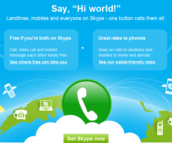
I'll move on now to one of the more tried and tested options, Skype. I feel this a good option due to the fact that almost everyone has an account with Skype, it's been around for a long time and offers a number of services that most people would probably pay a decent fee for, all for free.
Again it is accessible with the iPhone(however not restricted to the iPhone and is now one of the leading features of the 3 network) and would allow members to get in contact with each other easily if they wished to discuss something rather than typing it in. The webcam feature would also come in handy perhaps to show of drawings that have been done and so on.
All three of these techologies could come in very handy for us as a group in my opinion and I will definitely be saying to my fellow members about the possibilities of using each of them. My favourite has to be Dropbox, and I'm really impressed with the accessibility that it displays to the user. I really think it could be a key component in putting our work together
Colour(Kuler) Schemes
This week I also decided to take a look at possible colour schemes for the group to base our branding on. As the company is called, "Show Racism The Red Card" the colour red will obviously feature, but the others must be taken into consideration. The colours black and white should feature due to their contrast and link to race. Black also features heavily on the uniforms of referees, which is something to think about whereas a lot of sports balls are designed in white.
Shades of red must be considered. Will a number of different shades be used or should we stick to the one colour of red? If we do, it must be a very strong shade, one which is capable of dominating the screen but without overpowering it and becoming boring or even too much for the viewer to look at for a prolonged period of time.
I will head on over to Kuler and try to produce a good theme based on the ideas I have came up with here.
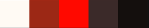
I'm really pleased with this colour scheme I have found and feel it suits the need of the project well. This is the one I will base my branding designs on
Week 3
Brand Identity and the Design of a Logo
This week I have been asked to create a Brand Identity for the Show Racism The Red Card organization. I have to go ahead and design a potential logo for them to use. I must take into consideration where they will use this, eg. on their website, banners, business cards etc. and how the logo will fit in on each. I will take a look at some of the current campaigns against racism logos and see how they represent the company that uses them.
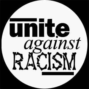
One thing I have noticed is that they all tend to rely heavily on text to make up the majority of their logos. It's quite interesting in the sense that nobody has really went and tried to create a definitive icon that could be used on websites or otherwise. At first I thought it would be too hard to find something in the form of an icon which truly represents Racism but it is probably the same with most companies and their attempts to design something that truly represents them without using text.
The likes of a fist could be used to demonstrate strength and resistance against Racism and an animated image of people of different colour together could work but a truly original idea will be hard to come by. For now I think I will base my logo design on text but I will have a think about how I can intigrate different elements into the idea in the coming weeks.
What makes Branding Work?
Seeing as we are on the topic of branding I thought I would take a look at what makes a particular type of branding more superior over other kinds.
I will look at different sports pages as a way of showing the differences in companies branding, see how it benefits the bigger companies and demonstrate how a lot of their success can come from just representing themselves well visually.
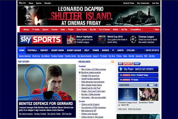
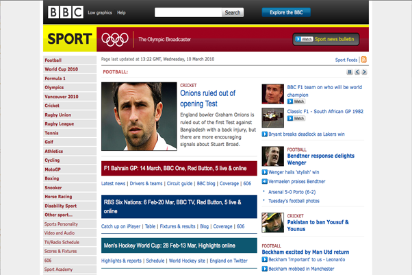
Here we have two good examples of sports websites branding their sites well. The Sky Sports site is obviously generated by the Sky company and so they will wish to link users of the sports site to other aspects of the sky.com site. This comes in the form of the toolbar at the top which gives you options to navigate to areas such as, news, showbiz, email & tools, Sky Customers and even a button to join Sky.
Within the site, when you click on say a football page about a certain team, it will provide odds for the football teams next match that you can choose to bet on if you so wish. It will also give details of their next match on TV which could influence the reader to go ahead and purchase the Sports package that Sky have available.
The BBC site is very similar in its approach but due to being a different kind of company, which doesn't sell its product to the target audience, it will go ahead and give links to the likes of charities such as Sports relief. It will also make you aware of any sporting events that are happening on TV soon and give video links that can give access to it's iPlayer set up which it is trying to push pretty heavily at the moment.
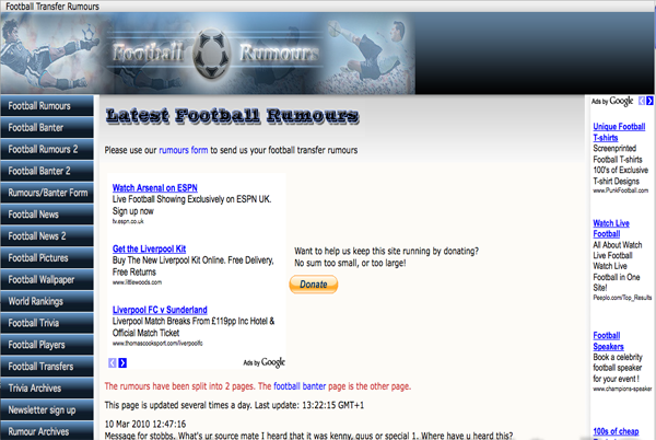
Here on the other hand we have a lesser known website called Football Rumours. Basically anyone can send a potential rumour to the site and they will post it. Pretty bad concept I know. The problem from the site stems right from the beginning. The first thing it depicts is it's Google Ads before we can even get near what we have came to the website for: Those awful rumours. On top of this, they're logo is poor and they have used a number of poor graphics to put it together. Their navigation system down the left hand side is very poorly thought out and is visually unappealling. To top it all off it has the gull, right at the very top beside the Google Ads to ask for donations to keep the site going which is pretty optimistic of them.
Obviously they cannot be expected to compete with BBC or Sky Sports but they're certainly not showing much ambition to change that and the likelihood of anyone staying around longer than a minute to flick through the content is very slim indeed.
Week 4
The Web Mobile Revolution
Having started an assignment, where I have to create an iPhone application in another module, I began to think about what the world of mobile web technology has done for web design and how ideas are having to be changed, and certain pieces of code added much like what is necessary for certain browsers. I will take a look at how certain sites differ in terms of how their site comes across on a desktop/laptop platform as opposed to a mobile web platform. As I am dealing with the iPhone for my assignment, I will research on the iPhone simulator. I know that there are various other smartphones out there that are capable of producing an experience similar to the iPhone in terms of web capabilities but in order to draw a direct comparison I will stick to the iPhone.
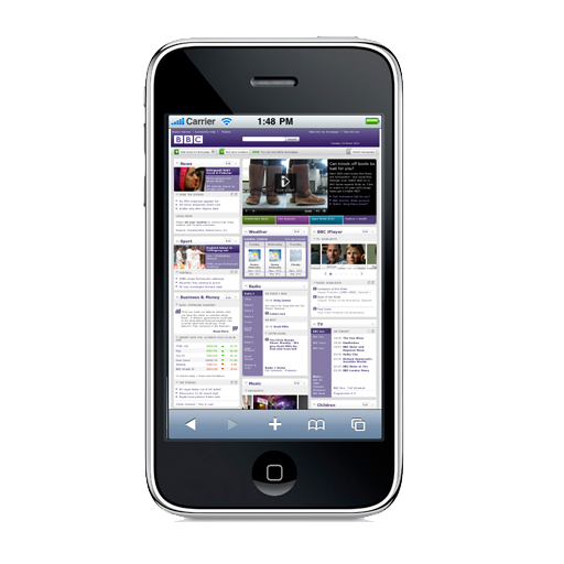
Firstly I will look at how different websites appear on the Safari app, and how designers have coded their sites to appear in a more compatible way on a mobile platform. The first site I will look at is the BBC site and how it has changed it's site to cope with the much smaller amount of space that is provided for websites on an iPhone.
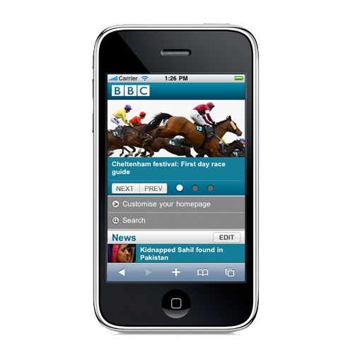
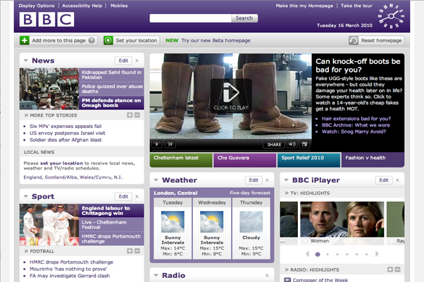
We can see the differences in the form of the sheer content involved on the main BBC site compared to the cut down mobile web version. For the Mobile version, the designers have decided to just go with the main features of the site and stack them vertically. To do anything else would result in a pile up and nothing would really get seen. Here we have the Desktop version of the site featured on the iPhone. As we can see, it's quite hard indeed to get anything done or selected.
The fact that we are taking on this project of putting our website out there in the form of a web app is good both for the client to get his site across in different platforms and for us, to gather experience and an insight into how to implement our sites for the mobile web and why doing so is necessary. It comes back to the arguement of entering code to make websites complient for all web browsers with the likes of IE6 the main culprit. It's a good idea to get into the way of making sites compliant with as many browsers as possible as it is something that most clients will want us as designers to do once we are out there in the big bad world.
Week 5
Branding Standards
This week I will look at branding standards and how I and the rest of my group can implement these ideas into our design to confirm that our designs won't become something that we don't like once they leave are hands, and are controlled by the Show Racism The Red Card campaign instead of us. To look at it another way, the standards are a good thing for the client to have to ensure that they get the best out of the designs that we have provided for them. It wouldn't be in their best interest to put the design out there looking less than what it could look. It would portray the campaign in a bad light and might make potential users think twice about using the site or finding out more about the campaign.
As part of this weeks lecture we looked at the standards that big companies such as Ulster Bank and USAid have put together. I will take a look at the USAid guidelines and point out how strict they can be in terms of keeping everything as they have set it.
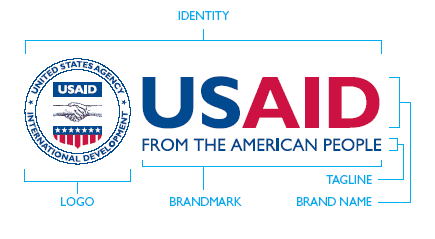
Here we have the logo they have set up with the icon and typography used together. Put together, they like to call it their identity. Everything as it's placed here is the way it should be placed no matter what. The logo(icon) always has to be to the left of the text and the colours can never be changed. It can be produced in black and white but only in the sense of photocopying. If the design is to be rescaled, it must be done so in both length and height to maintain the same shape. It cannot be stretched in anyway or else the identity is lost
So here we have a brilliant example of how companies don't like their designs to be messed with. They come across as very strict, but they have to be to be taken seriously. Nobody is now going to go and make changes to the design in a hurry and that is the way we will want our design to stay, just as we made it.
Week 6
Enneagram Test & Teamwork Breakdown
This week we discussed the Enneagram test and what it can tell us about what type of person we are. The test consists of 36 questions and you can be one of 9 types of people:
- 1. The Reformer
- 2. The Helper
- 3. The Achiever
- 4. The Individualist
- 5. The Investigator
- 6. The Loyalist
- 7. The Enthusiast
- 8. The Challenger
- 9. The Peacemaker
I had took an interest in the test after it being discussed in length in the most recent lecture and my results were as follows:
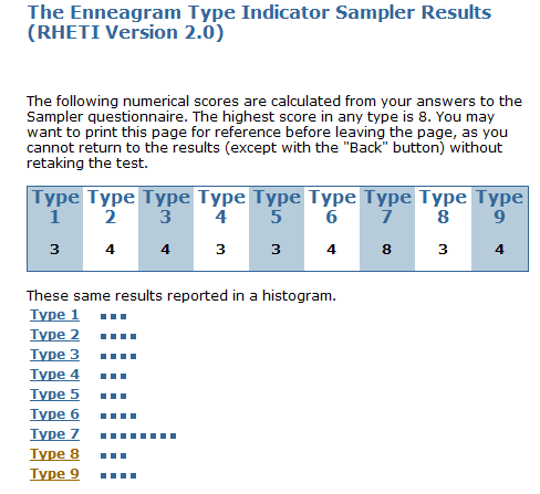
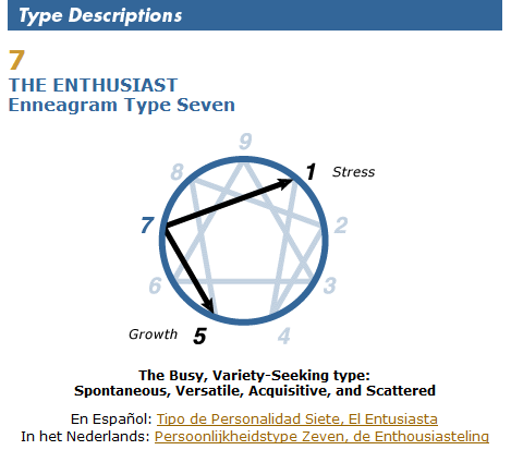
So my result is, Number 7 The Enthusiast. The results go on to say that Sevens are extroverted, optimistic, versatile, and spontaneous. Playful, high-spirited, and practical, they can also misapply their many talents, becoming over- extended, scattered, and undisciplined. They constantly seek new and exciting experiences, but can become distracted and exhausted by staying on the go. They typically have problems with impatience and impulsiveness. At their Best: they focus their talents on worthwhile goals, becoming appreciative, joyous, and satisfied.
I have to say I agree with the results and had fully expected them to be as such
In other matters I was given the task of breaking down the rest of the work that needs done for the client. This is what I came up with:
Jordan - In charge of designing, altering and maintaining images to be used in all sources of media. Will also be in charge of deciding upon the final colour scheme. Can help out with the coding if necessary.
Chris - In charge of the content, transferring from the current site to our site. Also in charge of research and gathering of quotes for example from other racism based sites from big sports stars. Can help out with the coding and design if necessary.
Rebekah - In charge of coding and construction of website, especially Javascript and PHP elements which she has a key knowledge in. Also in charge of keeping the group in line and ensuring deadlines are met etc.(However ultimately this will be down to individuals.
Daniel - In charge of coding and construction of website, with an eye on the XHTML and CSS side of things. Available to help out with content and design if necessary.
With my task set as coding the XHTML and CSS of the site, I have a lot of work ahead of me, and will have to get stuck into it almost immediately. As the team is coming together to design visual comps and wireframes for the potential layout of the website, it will be interesting to see what they come up in regards to how the shape should take shape.
Week 7
(Creative Experimentation here)
Week 8
(Creative Experimentation here)
Week 9
(Creative Experimentation here)
Week 10
(Creative Experimentation here)
Week 11
(Creative Experimentation here)
Week 12
(Creative Experimentation here)


