Creative Experimentation
Week 1
Meeting the Client and Getting Back Into The Way of Things
Into Week 1 and back to world of Creatively Experimenting! This week we met our client the founder and administrator of Show Racism The Red Card. He had come to talk to us about the project that we were set to begin. The project is based on the Show Racism The Red Card charity and we have been asked to create both a website and a new brand for the company to use from now on.
In order to get back into the way of things, and to get my head round the concept of our new project I decided to come up with a few branding ideas.
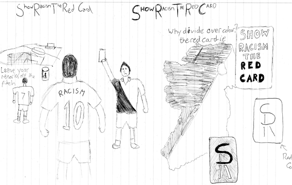
Here's a simple marketing concept I came up just as a means of spurring my imagination into gear. It's an idea that could possibly be used as a poster. For the time being I have put a basic text version of the company's website as a kind of logo in the bottom right hand corner, but this can be altered to feature the logo that we decide to use later in the project.
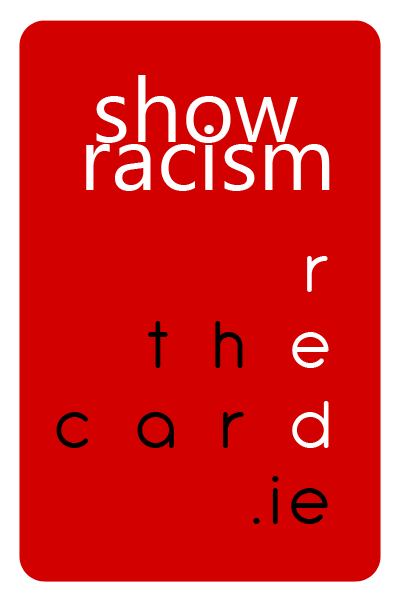
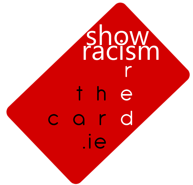
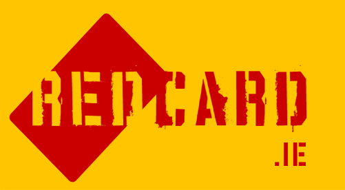
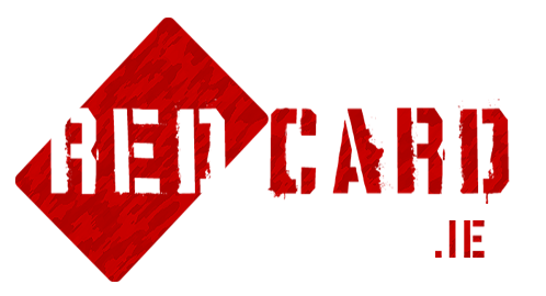
Here's another concept I came up with featuring the name of the organisation, with the last three words combined in a pyramid type of structure. The current URL for the company's website is theredcard.ie, which is another reason why I decided to combine those three in particular together, and avoided including the words 'Show' and 'Racism'. The diagonal lines I have included just to feature something a little bit different in the design. Again this doesn't necessarily have to be used as a logo and could be used as a means of promotion in the form of a business card, with the person handing it out producing it like a red card as a referee would, and it could feature details on the back.
Week 2
Moodboards, Mind Maps & Collaborative Tools
This week we have been set the task of coming up with a Project Brief, designing a Mind Map or two and I will also be looking at potential collaborative tools to see if I can help design some with my team mates.
Firstly I will go about creating a moodboard. This will consist of images put together that represent Racism or will hopefully spark imagination within me to work with in the coming weeks.
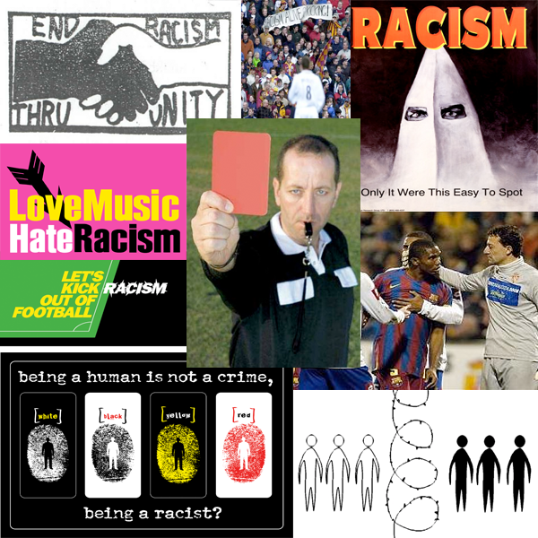
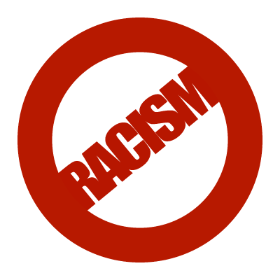
Here we have my moodboard. Featured on it we have a number of logos, posters, promotional pictures and examples of racism in sport. The logos come in the form of the crudely drawn, 'End Racism Thru Unity' one, along with better designed examples such as 'Love Music, Hate Racism' and 'Let's Kick Racism Out of Football', which is a particularly big anti-racism campaign that has been around for the best part of the last decade in the UK. Along with that we have the example of Samuel Eto'o refusing to play on in a match for Barcelona against a rival Spanish team and fans in an English Premier League match holding up a banner stating, 'Racism: Alive and Kicking'. In the middle of all the pictures I have the classic image of the Referee holding up the Red Card which is what the whole campaign revolves round and what it has based itself on.
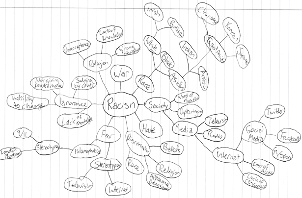
Now moving on to my Mind Maps which will consist of jotting down buzzwords that involve Racism or aspects of Racism that I can then go back to in future and relate to in my work.
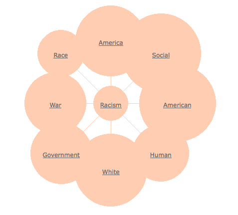
Here we have one that I developed on a site that I came across, however I feel that it is very basic and seems to lean towards keywords that American Folk would find most useful as opposed to anyone from Ireland/UK. So from here I decided to go ahead and develop my own using pencil and paper. Here's what I came up with.
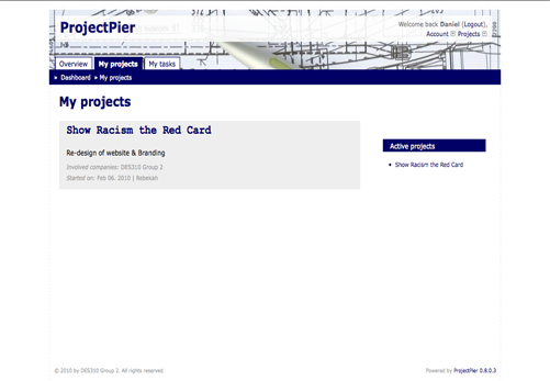
On the collaboration side of things, I have covered a bit of information on a number of possible tools in my Research Diary but on top of this, Rebekah from my group has created a system that keeps up to date with deadlines and lets the user know when deadlines are coming up or when they have been missed for example. Once a task has been completed, the user can tick the relevant box for the task and it will be marked as completed.
Week 3
Brand Identity and Logo Development
This week I will be taking a look at the Brand Identity of the proposed Show Racism The Red Card company along with developing the logo design's that I have came up with so far, and I will also have a go at coming up with a few other ones.
When considering the brand identity we as a group must consider what approach the campaign wishes to take. Points of interest in this will be:
- What target audience are they aiming towards?
- Are they wanting to come across as hard hitting in their approach?
- What colour scheme should be used in their logo's, web set up etc.?
- Should we automatically assume that the main colour should be red?
The campaigns put together rely heavily on sports and uses big sports stars to get the message across, however a lot of these campaigns to date seem to be aimed towards children. This is different to alternative Anti-Racism Sports campaigns across the water for example where the campaigns are used in an attempt to remove Racism from sports at every level. I think that the general all round approach is a better one, and is what the SRTRC campaign should be aiming at. Thus the logo and design of the website etc. must be portrayed as such.
In terms of how they are wanting to come across, I feel that they want to get their message through to people in a fun kind of way. Hard hitting is definitely not the way to describe it in this case, and generally I feel this is the correct way to go. For a campaign that hasn't got a huge financial backing, I think it would wrong of this to try and force their ideas down peoples throats. They need to just put it out there and advertise at sporting events and let the user have the option to interact if they so wish.
Having already taken this idea into consideration in my Research Diary, I feel the colour scheme would be best represented with a Red, White and Black theme. To answer the final question as well, I believe using red as the main colour is definitely the right course of action. Set a main colour of red to base everything else on and have a darker red that is closer to black, along with a lighter shade that is closer to white(without being pink), to give a bit of variety and yet stick to strict visual experience.
Moving onto Logo Development, I will take the idea that I layered onto a red card and play around with it a bit in an attempt to make look all around, a little bit nicer.
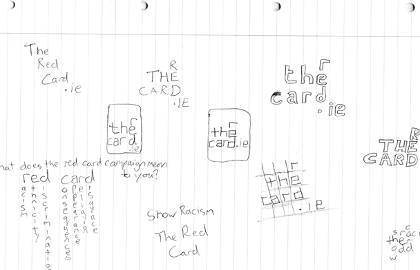
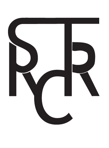
I also began to draw an idea that combined the first letters of all the words of 'Show Racism The Red Card'. I may have a go at making this in weeks to come.
Week 4
Feedback and Other Ideas
This week we had our critique session with the client in order to get some feedback for the logo's we had designed. We each had a logo design put forward for him to look at. The one of mine that was chosen perhaps wasn't my strongest but it gave a fair idea of the principle design I had in mind.
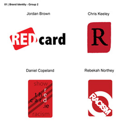
All the logo's have some pretty good elements, but the ones that jump out at me from the four options are Rebekah's and Jordan's. Rebekah's in particular has a lot of potential and I have a few ideas of how to go about adding and potentially improving it. Currently it is placed on top of a red card shape, which would work very well in the form of a business card, but in terms of a logo I feel it would look better as just the circular shape. This would allow placement in numerous situations for us and the client to use with ease.
Jordan's idea work's quite well and has the added bonus of being able to resize with ease to allow implementation in many different areas. Not as many ideas jump out at me of how to improve or change it which is potentially a good thing. I will take a further look in an attempt to draw more ideas from it.
I think mine and Chris' idea need a fair bit of work. Mine potentially doesn't work overly well in the form of a logo due to the sheer amount of text involved and Chris' doesn't really say enough about what it represent's and couldn't really exist without further text or another logo explaining what it's about.
The client was a big fan of Jordan's idea and felt it would work well with the campaign. To my surprise he didn't react as warmly to Rebekah's as we had expected however this may just be a case of it needing to be updated and altered a bit.
Week 5
Refinement of Group Logos
Having got feedback on our respective logos, we decided to come together in an attempt to edit each others designs and come up with something that we all felt happy with.
Before doing this though I decided to attempt to implement my logo of combining all the first letters of the company name 'Show Racism The Red Card'. I felt I could make a sports team badge design out of the idea and set about making this a reality.
This is an idea that will in all likelihood not be used as a main logo but could be used for a campaign if the company were wanting to take on a 'Sports Club' approach. I will put the idea past the rest of my group members and see what they think.
I will now move on to editing the ideas my fellow group members have put together. First of all I will look at Jordan's design and see if there are any variations I can put in place.
The ideas are fairly similar, but I felt that showing both would give an idea of how different colours could be implemented into the design and that we don't have to stick to the generic colours of red, black and white.
The designs took on the idea of Jordan's slanted card shape with the text featured over the top and breaking up the card by using the same colour as the background as we used for the text. In the case of the one with the white background, I added a few filters over the red card and the red text to make it more eye catching to anyone who may be viewing it.
Now I will take a look at Rebekah's design. As I stated previously, I think the design would benefit from losing the red card from behind, and simply use the circular shape that is featured.
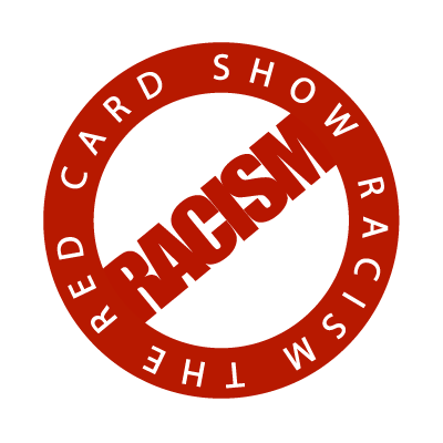
The idea I've put across here is one representing something more like a stamp. I'm a big fan of it and think it could work in very well in many different scenarios. I will put the ideas that I have came up with across to my team mates and see what they think.
Week 6
Tech Spec & Navigational Structure
This week we had four sections to complete and as a result, decided to do a section each to speed the process up.
- Team Work Breakdown
- Content Audit
- Navigation Structure
- Technical Specification
I was chosen to do the Teamwork Breakdown which consisted of the following:
Jordan � In charge of designing, altering and maintaining images to be used in all sources of media. Will also be in charge of deciding upon the final colour scheme. Can help out with the coding if necessary.
Chris � In charge of the content, transferring from the current site to our site. Also in charge of research and gathering of quotes for example from other racism based sites from big sports stars. Can help out with the coding and design if necessary.
Rebekah � In charge of coding and construction of website, especially Javascript and PHP elements which she has a key knowledge in. Also in charge of keeping the group in line and ensuring deadlines are met etc.(However ultimately this will be down to individuals.
Daniel � In charge of coding and construction of website, with an eye on the XHTML and CSS side of things. Available to help out with content and design if necessary.
With my task set as coding the XHTML and CSS of the site, I have a lot of work ahead of me, and will have to get stuck into it almost immediately. As the team is coming together to design visual comps and wireframes for the potential layout of the website, it will be interesting to see what they come up in regards to how the shape should take shape.
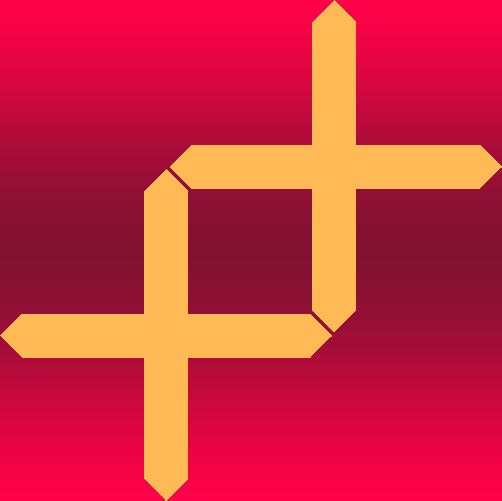
With the theme of being creative this week, I went ahead and designed a logo which consists of two plus signs. They are brought together by the pointed edges which see them come together seemlessly. I placed them on a deep pink gradient to make them stand out. Here I have featured the logo design in both a creamy/yellow and a dark grey colour to display the difference. I liked how the logo turned out and I am currently displaying it as part of my Twitter Background.

Week 7
Visual Comps
This week we had to go about designing Visual Comps & Wireframes for our potential sites. We decided the best course of action here would be to each come up with a design and showcase it to one another in an attempt to come up with something ultimately, very good through a combination.
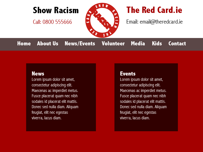
For the design we decided to go with the circular stamp logo that I had edited from Rebekah's original logo. We decided to remove the text circling the stamp shape and just go with the straight forward red circle/text as the cross out line.
I decided to go with the main colour of red in my design which seemed like the best course of action to tie in with both the logo, and the name of the campaign. But I also wished to stay true to the colour scheme that we had put in place and decided to try and stay true to.
Click image for larger version
In this design I have decided to have the navigation system situated on the left hand side. This menu is based almost entirely on the links provided on the current website. Having the links featured on the right, freed up space at the top to provide a lot of information and even an image of the campaign in action with some football stars highlighting the campaign by holding up the current logo.
Onto the main body of the page and again there is a lot of space to work with. I didn't want to leave it completely white and so added the diagonal lines running across the page which tie in to some degree with the set colour scheme. I felt using text boxes with a lower opacity may prove beneficial and this is something we may be able to achieve by implementing elements of HTML5 and CSS3.

Click image for larger version
This design is a bit more basic and is just in place to show how the design may work with a horizontal menu. I also decided to throw in a white background at the top so that the contrast in colours down the page, catches the eye more effectively. Again I went for the low opacity text box background.
Week 8
(Creative Experimentation here)
Week 9
(Creative Experimentation here)
Week 10
(Creative Experimentation here)
Week 11
(Creative Experimentation here)
Week 12
(Creative Experimentation here)


